Color Spaces
An introduction
To ensure you understand what Material 3 is all about, it helps to understand how color spaces work, as these are a very important part of Material 3.
Color spaces are mathematical models describing the way colors can be represented. The easiest way of visualising them is to think of a box containing all the possible colors that can be produced by mixing the three primary colors of light: red, green and blue.
CIE 1931 xyz, The Mother of All Color Spaces
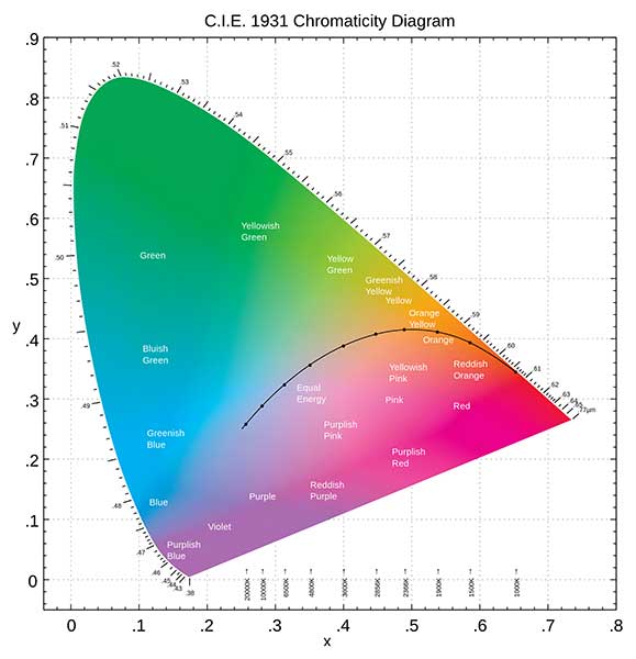
The International Commission on Illumination (Commission Internationale de l'Éclairage or CIE) is the world’s authority on light. Under its auspices, a scheme was developed for modeling color, based upon human vision. The resulting CIE 1931 XYZ color space, an early attempt based on measurements of human color perception, is the basis for almost all other color spaces today.
And that was in 1931 when there were no computers...
RGB, the color space everybody knows
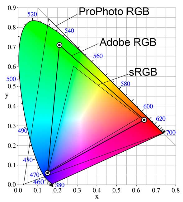
sRGB was created in 1996 by HP and Microsoft for use on monitors, printers and the Internet. It’s the default color space in all digital cameras and scanners as well as photo printing kiosk monitors, and may be the only color space supported by many of these devices.
The RGB color space is normally shown graphically as RGB diagrams in which the amount of green is mapped along the one axis, the amount of red on another, and the amount of blue on a third, with saturation increasing outwards from the center. To fit three axes to a two-dimensional format, mathematicians have come up with a diagram that looks like the illustration below.
Working with RGB however is rather difficult: as it is an additive method, it is hard to see from the hexadecimal value which color it is, how bright it is, and the lightness value.
HSB (Hue, Saturation, Brightness) and HSL (Hue, Saturation, Lightness/Luminance) are other methods to describe the color and are far easier to understand.
Modeling the human eye
sRGB is great for computers and photography, but it doesn't come close to predict how our eyes perceive hue, chroma and lightness.
Don't use it for that!
The CIE 1931 color model is from 1931, and was a first attempt to model the human color perception.
Several models have replaced the original CIE xyz model to better model the human eyes. Different models are created for computers screens and things like print and paint.
Our eyes are special. They can see many colors, but need a minimal color difference to recognize them as different colors. We also have different lightness and chroma (colorfulness) perception for different colors.
All the newer models try to do a better job in modeling our eyes. CIELab, CIELuv and CAM16 are the best known among them. CIELuv is suited better for computers screens than CIELab, and CAM16 (from 2016) is the latest and greatest of the color space models.
The CIEL* models also have a color wheel variant, comparable to HSB/HSL. It is called CIELch: Lightness, Chroma and Hue. Lightness is a percentage 0..100%, Chroma a variable number, and Hue the number of degrees (0..360°) in the color wheel.
To give you an idea how these modern models perform, I included some screenshots.

 Hue linearity: diagrams should be balanced. Winner: CAM16

 Color prediction: diagrams should be circles at best. Winner: CAM16

 Lightness prediction: diagrams should follow the Fairchild-Chen data. Winner: CIELAB
Conclusion
So, none of them is perfect in predicting how hue, chroma and lightness are percieved.
Now we know this, what is all the fuzz about Material 3? Why is Material 3 so different from Material 2?
And why did I like it so much, that I wanted to use this for Home Assistant themes?