Introducing Material 3
The Material 3 color system breaks with the previous Material Design version in many ways. It contains a number of important new features. All these features are described on the Material 3 website.
The most important aspects are described below.
Material 3 color design aspects...
The table below shows the 3 design aspects that Material 3 introduces:
- Dynamic color, so an Android user can use an image to generate a matching theme
- Design tokens. These are important for app developers: they should use them, otherwise the theme won't work in their app
- Accessibility. The last point, but the one with the most impact. This is what really sets Material 3 apart from previous versions!
| Dynamic color | . |
|---|---|
| The color system in M3 enables user preferences and needs to interact with an app’s colors. Dynamic color specifically describes the convergence of user settings with the system UI and in-app color experiences | |
| Design tokens & tool | |
| Design tokens enable flexibility and consistency across a product by allowing designers to assign an element's color role in a UI, rather than a set value. Tokens act as a bridge between an element's assigned role and the chosen color value for a role. With the addition of tokens, designing for relationships of elements is more fundamental than selecting specific colors | |
| Accessibility | |
| Dynamic color is designed to meet accessibility standards for color contrast. The system of tonal palettes is central to making any color scheme accessible by default. Combining color based on tonality, rather than hex value or hue, is one of the key systems that make any color output accessible. Products using dynamic color will meet requirements because the algorithmic combinations that an end-user can experience are designed to meet accessibility standards. |
Material 3 dynamic colors...
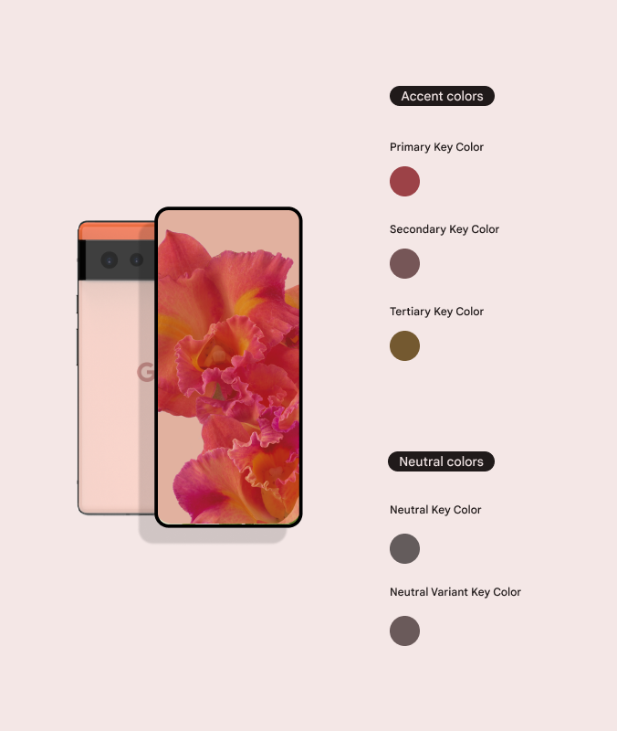
User-generated color schemes are an important feature of the M3 color system. The example below demonstrates how user-generated colors can be created and then manifest in a UI.
Color from user wallpaper
A user’s wallpaper selection is the basis for the color extraction algorithm to build a color scheme that’s applied across a user's device and any apps that accept dynamic color.
A single source color is used to derive 5 tonal palettes that provide the basis for any light and dark theme use cases. Error colors are also slotted automatically, but are not technically included in the algorithmic extraction.

From color extraction to color schemes
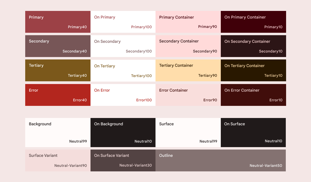
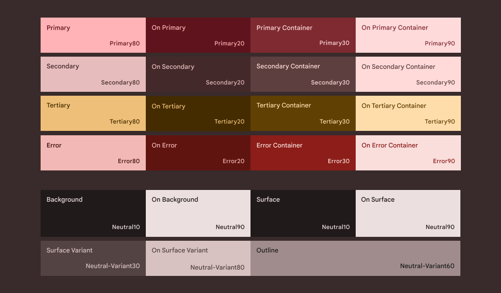
Given the tones that are derived from the wallpaper example above, tones are slotted into specific color roles that are mapped to Material components.
A user-generated scheme produces the range of tones needed for both light and dark theme applications.

Example of a light theme color selection generated by a red floral wallpaper.

Example of a dark theme color selection generated by a red floral wallpaper.