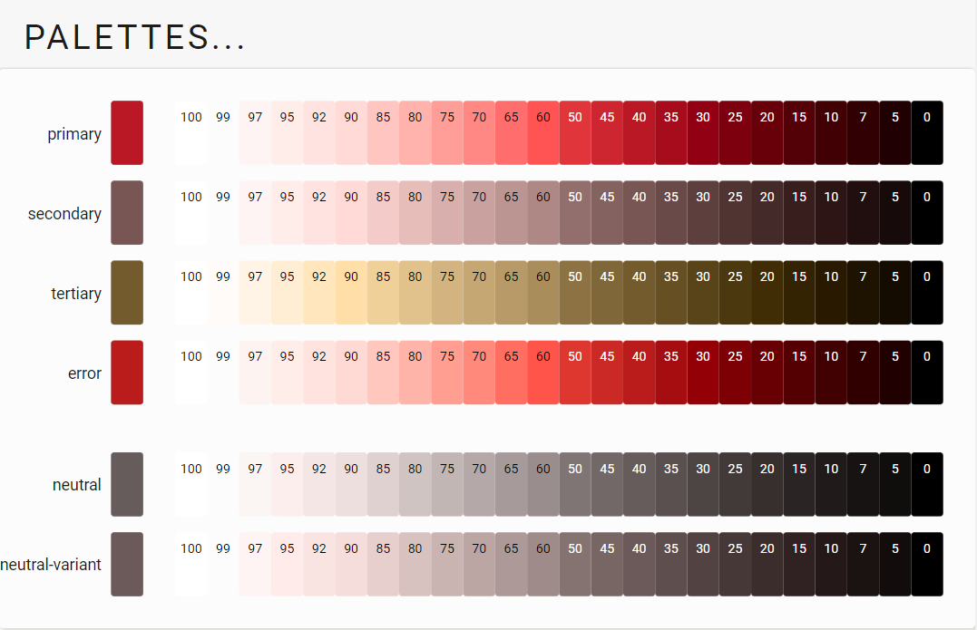
Theme Palettes
M3 Palettes...
One of the main highlights of Material 3 is the tonal palettes that should meet WCGA standards.
As Google says:
Dynamic color is designed to meet accessibility standards for color contrast. The system of tonal palettes is central to making any color scheme accessible by default.
Combining color based on tonality, rather than hex value or hue, is one of the key systems that make any color output accessible. Products using dynamic color will meet requirements because the algorithmic combinations that an end-user can experience are designed to meet accessibility standards.
As HCT uses the CIE-L* colorspace for lightness, lets see if what that does with a generated tonal palette.
CIE L* lightness check...
I took the C1 example and checked the lightness values.
Color conversion using sRGB and CIE-Lab
| color | hex | m3 | Lightness (sRGB-hsl) | Lightness (CIE-Lch(ab)) |
|---|---|---|---|---|
| Primary20 | #68000a | 20% | hsl(354.2°, 100%, 20.3%) | lch(19.9%, 49.3, 32.3°) |
| Primary40 | #bb1826 | 40% | hsl(354.8°, 77.2%, 41.3%) | lch(40.1%, 71.3, 31.3°) |
| Secondary40 | #775654 | 40% | hsl(3.4°, 17.2%, 39.8%) | lch(39.9%, 14.8, 26.1°) |
| Tertiary40 | #735b2e | 40% | hsl(39.1°, 42.8%, 31.5%) | lch(40.1%, 29.5, 82.2°) |
| Primary60 | #ff5354 | 60% | hsl(359.6°, 100%, 66.2%) | lch(59.9%, 74.6, 29.5°) |
| Primary80 | #ffb3ac | 80% | hsl(5.0°, 100%, 83.7%) | lch(79.9%, 30.5, 28.7°) |
| Primary99 | #fcfcfc | 99% | hsl(0°, 0%, 98.8%) | lch(98.9%, 0.01, 296.8°) |
We see an exact match between the Material 3 lightness and the CIE-Lch(ab) lightness value for primary, secondary, and tertiary color palettes.
You may also notice how the sRGB values are sometimes close and sometimes very different from these CIE values, which is why sRGB is not suitable for this kind of calculation.
Material 3 is indeed using the CIE-L* colorspace to determine the lightness for tonal palettes
Now let's take a look at the primary, secondary and tertiary palettes. Can we make sense of them?
Primary palette
Let's do some observations and look at the primary palette first!
Experiment 1: how do primary palettes compare?
Below you can see all primary pallets from the "custom" color examples. Please note that all x2%, x5% (except 95%), and x7% values do not belong to the original Material 3 palette, but were added by me to have more tonal steps to work with.
Some noticeable things from right to left:
- Some colors have less chroma/colorfulness in the darker areas than other colors: the red/blue/magenta show more chroma in darker tones than yellow/lime/green/cyan.
- There is a clear "break" visible at the 50%/60% tones: exactly the boundary between the dark and the light tones
- Another "break" is visible in many of the palettes between 80% and 90% (85% was added by me).
- Some of the colors are very colorful in the high lightness parts (say above 90%), and others are not. Especially the yellow, lime green/green, and cyan stand out.
This is especially visible in the 99% lightness blocks. The above colors are visible, others are barely distinguishable.
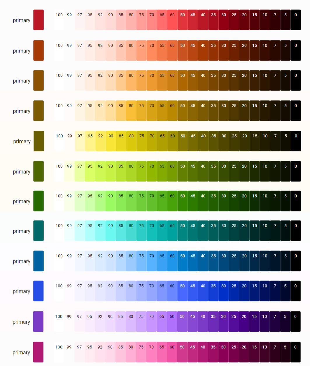
And that is to be expected, as these colors can have more chroma with high lightness values in the sRGB space when translated from CIE-L* space than the others.
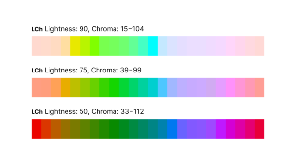
The following example shows this effect: yellow, green, and cyan are more colorful than any other color at higher lightness! Blue, purple, magenta, and red are much more subdued. The reverse is also valid: blue, purple, magenta, and red are more vibrant in darker tones.
Note that dark orange with high chroma does not exist: that is what we call brown! The same is valid for yellow: mixing that color with black also turns brownish.
Material 3 is palette calculations are again clearly using CIE-L*, but does NOT compensate for the colorful colors in the high lightness parts
Experiment 2: what about palette hue?
Since I couldn't find a CAM16 conversion table, I use CIE-Lch(ab) and CIE-Lch(uv) to check the tint values with different lightness. The results are therefore less accurate but averaging the results should should make them usable compared to CAM16.
If we look at the next table, we can see that Material 3 is not only varying lightness for the tonal palette but also varying both chroma and hue. As we have learned from the above observation, keeping the hue stable in the high lightness parts is difficult.
Color conversion using CIE-L*
| color | hex | m3 | Lightness (CIE-Lch(ab)) | Lightness (CIE-Lch(uv)) |
|---|---|---|---|---|
| Primary20 | #68000a | 20% | lch(19.9%, 49.3, 32.3°) | lch( 19.9%, 64.8, 10.5°) |
| Primary40 | #bb1826 | 40% | lch(40.2%, 71.3, 31.3°) | lch(40.2%, 119.5, 10.6°) |
| Primary60 | #ff5354 | 60% | lch(59.9%, 74.6, 29.5°) | lch(59.9% 134.3, 11.9°) |
| Primary80 | #ffb3ac | 80% | lch(79.9%, 30.5, 28.7°) | lch(79.9%, 52.9, 17.2°) |
| Primary99 | #fcfcfc | 99% | lch(98.9%, 0.01, 296.8°) | lch(98.9%, 0.01, 247.1°) |
We see slight differences in Hue in lower lightness parts, and big differences in high lightness parts
This was expected. The slight differences in the lower lightness parts might be absent in CAM16.
Secondary and Tertiary palette
For starters, the "normal" way to choose a secondary or tertiary color is to move the color wheel a few degrees. The secondary color is usually a supporting color for the primary color, and the tertiary color more like an accent color.
Experiment 3: Can we make sense of secondary and tertiary colors?
I'm using CIE-LCh(uv) for this experiment. It's not very good at predicting chroma and hue, but maybe we can see something. Chroma is better than the Hue prediction.
Using the mean values and differences, the variations between CAM16 and CIE-LCh(uv) can be smoothed out.
Secondary color palette:
- The hue value varies but stays close to the primary hue value with an average difference of 0.05° (so nearly the same!).
- The chroma value seems to be very constant: ~20 for red and yellow, and around ~16 for the other colors. The chroma for the primary color has all sorts of values, so this can't be a coincidence.
Tertiary color palette:
- The hue value hovers between 39° and 83° with an average of 61°.
- The chroma value hovers between 21 and 38 with an average of: 28.
| What | hex | Lightness | Chroma | Hue | H Diff |
|---|---|---|---|---|---|
| C1, Red | |||||
| Primary | #bb1826 | 40.2% | 119.5 | 10.6° | |
| Secondary | #775654 | 39.9% | 21.8 | 15.68° | 5.1° |
| Tertiary | #735b2e | 40.1% | 35.4 | 58.4° | 47.8° |
| C5, Yellow | |||||
| Primary | #695f00 | 39.9% | 44.2 | 76.9° | |
| Secondary | #635f41 | 39.9% | 21.5 | 79.3° | 2.5° |
| Tertiary | #406652 | 39.9% | 21.3 | 147.3° | 70.4° |
| C7, Green | |||||
| Primary | #276c00 | 39.8% | 56.2 | 122.7° | |
| Secondary | #55624b | 39.9% | 16.6 | 112.0° | -10.7° |
| Tertiary | #386666 | 40.1% | 20.8 | 192.2° | 69.5° |
| C9, Blue | |||||
| Primary | #0062a1 | 40.1% | 63.8 | 247.4° | |
| Secondary | #526070 | 40.1% | 16.4 | 241.8° | -5.6° |
| Tertiary | #695779 | 39.9% | 25.61 | 286.6° | 39.2° |
| C11, Purple | |||||
| Primary | #7a3ac5 | 39.9% | 94.4 | 278.5° | |
| Secondary | #655a70 | 40.0% | 16.6 | 286.0° | 7.6° |
| Tertiary | #80525a | 40.2% | 28.8 | 1.6° | 83.2° |
| C12, Magenta | |||||
| Primary | #b01a72 | 39.9% | 85.5 | 342.8° | |
| Secondary | #735762 | 40.1% | 16.6 | 344.3° | 1.6° |
| Tertiary | #7e5538 | 39.9% | 38.2 | 38.0° | 55.3° |
And finally, lets see how these observerations stack up against the real thing, as the calculations are known for both palettes:
HCT Secondary color palette calculation:
- Hue is the same as for the primary color palette. Matches with the 0.05° difference.
- Chroma is fixed to 16! I got 2x20 and 4x16 (average of 18.2), so still a good match for some of the colors.
And the HCT tertiary palette calculation:
- Hue is shifted 60° from the primary color palette. The CIE-LCh(uv) averaged at 61°. Again pretty close!
- Chroma is fixed to 24! I got 28 from CIE-LCh(uv). CAM16 is much better for chroma.
The average CIE-LCh(uv) values and differences are close to the actual CAM16 settings
But you can clearly see the differences between the two color spaces in the individual colors.