How to use Material 3 themes
Once you have installed one of the Material 3 themes, you can use all the color definitions the theme offers in your Home Assistant (custom) cards.
To make full use of these theme color definitions, either the (custom) card itself should offer CSS styling functionality, or via a custom plugin that makes it possible to style parts of the card.
Start to use the Theme color definitions!
The key point in using all the features of the Home Assistant Material 3 themes is to use the theme color definitions whenever possible and appropriate. In that case, your card will follow the theme in both light and dark mode!
  # Note: below is from Swiss Army Knife tool "style" YAML section
  style:
    fill: var(--primary-text-color)           # Material text color
    stroke: var(--theme-sys-color-primary60)  # M3 theme system color
  # Note: below is from Swiss Army Knife tool "style" YAML section
  style:
    fill: red                                 # Hard coded red color
    stroke: #456712                           # Hard coded hex color
It can't get any easier 
Using theme definitions is not specific to the Material 3 themes: using them was already required for the light/dark themes to work
I will use Teal Blue example theme D06 to show how you can use a Material 3 theme. The card shown is example 12 from the Swiss Army Knife custom card.
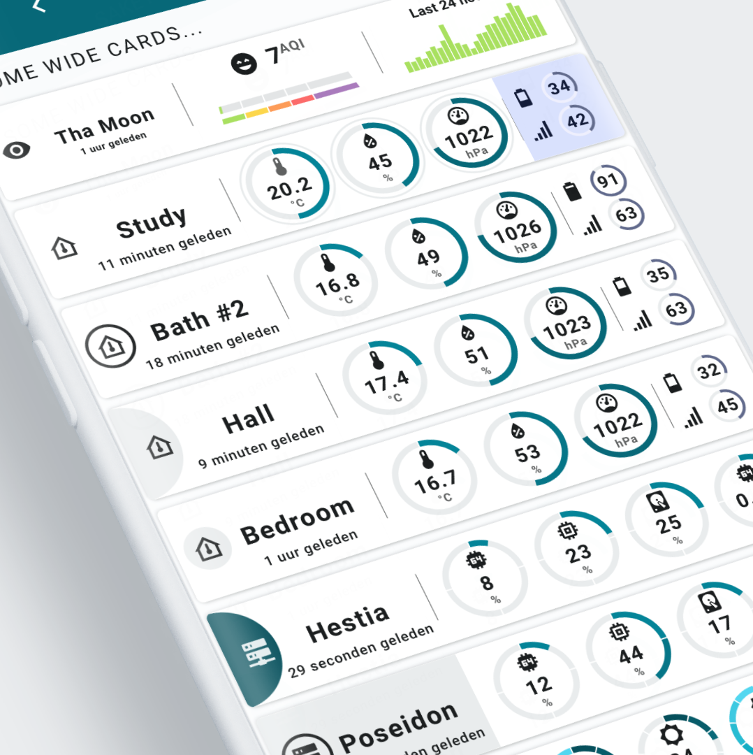 The light variant.
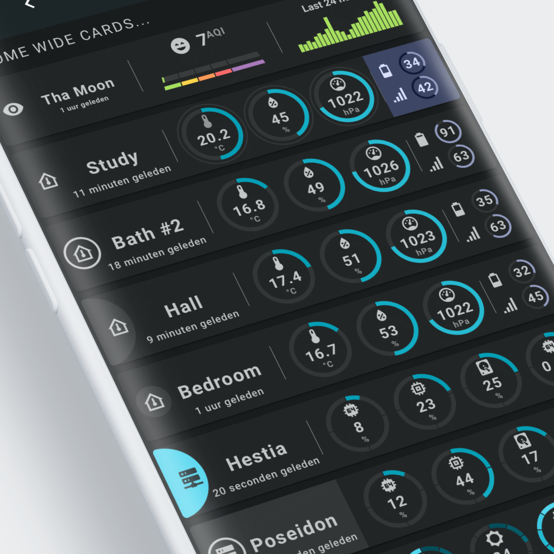 The dark variant.
How to use the standard material colors
The Material 3 themes map the color definitions to the standard Material Design color definitions Home Assistant is using. This means you can use the standard Material Design primary and secondary font and background colors as before to style your cards.
If fonts use the var(--primary-text-color) CSS variable, both light and dark themes should work out of the box!
For a list of used CSS variables by the Lovelace frontend of Home Assistant, look here
The above example uses these default font and background colors for the cards background and text parts.
How to define and use dedicated colors
In some cases you can't use the Theme colors, you need to use dedicated colors. Traffic light colors or the Airvisual colors are a good example of that use case.
You have 3 options to use dedicated colors in your cards:
- Use hard coded colors (HEX, RGB, HSL, etc.)
- Clone the theme you want to use, and define the colors in the theme, and use those custom color names in your cards.
Say you define them asYou can use the colors in the card using the CSS variabletraffic-light-red: red traffic-light-yellow: yellow traffic-light-green: greenvar(--traffic-light-red) - If the card is made with the Swiss Army Knife custom card, you can define those colors in the user CSS definitions, and use them in your card as CSS variables.
The above example uses dedicated colors (green, yellow, orange, red, purple) for the AirVisual representation in the first wide card.
| AirVisual color definitions for Swiss Army Knife segmented arc tool | |
|---|---|
1 2 3 4 5 6 7 8 9 10 11 12 13 14 15 | |
How to use the Material 3 colors
The Material 3 themes define more colors: primary, secondary, tertiary and error reference and system color palettes and surface elevation colors.
All these colors can be used as CSS variables.
All Material 3 themes support light and dark mode. It does this by redefining the system colors with theme mode dependent reference colors.
If you use Material 3 color names in your cards, non Material 3 themes will show fallback colors (mostly black and white)
Material 3 System colors
The Material 3 system colors are dependent of the theme mode (light or dark). Use this colors if you want to adapt the color to the theme mode.
| Light variant | Dark variant |
|---|---|
| Example d06, Teal Blue Light: | Example d06, Teal Blue Dark: |
System colors are used throughout this example:
- The background of the circles use a
surfacesystemcolor: this color is darker than the background in a light theme, and lighter than the background in a dark theme.
This surface color is also used in the half circle in the 'Hall' (4th) card, the circle around the icon in the 'Bedroom' (5th) card and the background of the first part of the "Poseidon" (7th) card. - The same is done for the actual value of the circles: these use the
primarydark variants in the light theme, and the light variants in the dark theme. - The circles for battery and link quality use
tertiarysystemcolors.
Check the Theme colors page for these system colors you can use.
| System color example 'Hall' (4th) card for Swiss Army Knife circle tool (half circle in first column) | |
|---|---|
1 2 3 4 5 6 7 8 9 10 11 12 13 14 15 | |
| Hestia color definitions for first Swiss Army Knife segmented arc tool | |
|---|---|
1 2 3 4 5 6 7 8 9 10 11 12 13 14 | |
| Hestia color definitions re-using YAML template | |
|---|---|
1 2 3 4 5 6 7 8 9 10 | |
| System color battery example using tertiary foreground color and neutral background color | |
|---|---|
1 2 3 4 5 6 7 8 9 10 11 | |
Material 3 Reference colors
The Material 3 reference colors are independent of the theme mode (light or dark). Use this colors if you want to keep the same color.
| Light variant | Dark variant |
|---|---|
| Example D06, Teal Blue Light: | Example D06, Teal Blue Dark: |
Reference colors are used only in the last card (hardly visible in the lower right of the image):
- The segments of the circles use
primaryreference colors: you can see they remain the same for both the light and dark mode.
Check the Theme colors page for these 264 reference colors you can use.
| Reference color example 'Illuminance' card for Swiss Army Knife segmented arc tool | |
|---|---|
1 2 3 4 5 6 7 8 9 10 11 12 13 14 15 16 17 18 19 20 | |